How Do Widgets Work?
Each brand has a different set of widgets. Widgets can be related to popular destinations, schedules, maps, etc. You can place widgets on blogs and websites that support external codes.
For example, users can use widgets to search for airline tickets. To do this, they simply need to enter their travel dates, destination, and other information. After users click the “Search” button, they are sent to the brand’s site, where they can book the travel service. If the user visited the brand’s site and booked the service thanks to your widget, you’ll receive a partner reward.
Advantages of Using Widgets
Advantages for Users
- Widgets make the customer journey shorter. Widgets contain all the necessary information that travelers should know. In this case, it is useful to pre-fill widgets. Thus, users only need to click on the “Search” button to buy the right service on the brand’s website.
- Widgets attract the attention of readers. All widgets are striking and dynamic. Users are unlikely to miss them while visiting your site or travel blog.
- Widgets help users compare several options and choose the best one. For example, travelers can choose accommodations in a suitable area using the map widget or choose a tour or activity at the best price through the offer comparison widget.
Advantages for Partners
- High conversion. We studied how many partners installed widgets and how many of these tools brought them paid bookings. The widgets’ conversion rate was 39.5%. This high conversion rate was achieved thanks to the many benefits of widgets that users appreciate. Widgets are also a great addition to links (37.4% for partner links).
- Easy to integrate into the site. Integrating a widget into your site takes about the same time as adding a link. Simply configure the widget at your discretion, copy the widget code, and add it to your site. You don’t even need to understand the code, it’s generated automatically.
- Additional CTA in the blog. Most widgets have a CTA (call-to-action) and a brief description of the brand and its services. A CTA always increases the chance of a purchase. You can create your own CTA or use both.
- It’s easy to customize widgets to your audience and content. In the widget settings, you can select a language that is convenient for your audience, pre-fill the widget with a location, and specify many other parameters.
- You can do experiments. You never know for sure what works best. In the world of affiliate marketing, you always have to experiment and monitor the effectiveness of your strategies. Widgets are a flexible partner tool. Try combinations of different types of widgets, together with links, place them in different spots around the page, pre-fill the fields, or leave them blank. Explore all the features of the tool to find the best strategy for placing widgets on your project pages.
- You can earn on widgets and the Travelpayouts referral program. In the widget settings, you can activate the “Add my referral link” option. If you turn it on, the “Powered by Travelpayouts” button will appear at the bottom of the widget. Clicking on this button will take users to the main Travelpayouts page. If those users register in the partnership platform, they’ll become your referrals. You’ll receive 7% of each referral’s earnings on all programs for two years. Learn more about our referral program in our post.
Try the widgets now. To do this, check if there are widgets in the programs you’ve joined and, if necessary, subscribe to partner programs that have such tools.
Types of Travelpayouts Widgets
Search Form
Search forms help users quickly find the right brand offer directly on your website. All the user has to do is enter the necessary information into the widget.
For example, if you’ve integrated a form for finding accommodations on Booking.com into your website, users only need to specify the destination, check-in and check-out dates, and number of guests. When the travelers click on the “Search” button, they’ll go to the brand’s site and will be able to book an accommodation. If the booking is successful, you’ll receive a partner reward.

Availability Widget and Calendar Widget
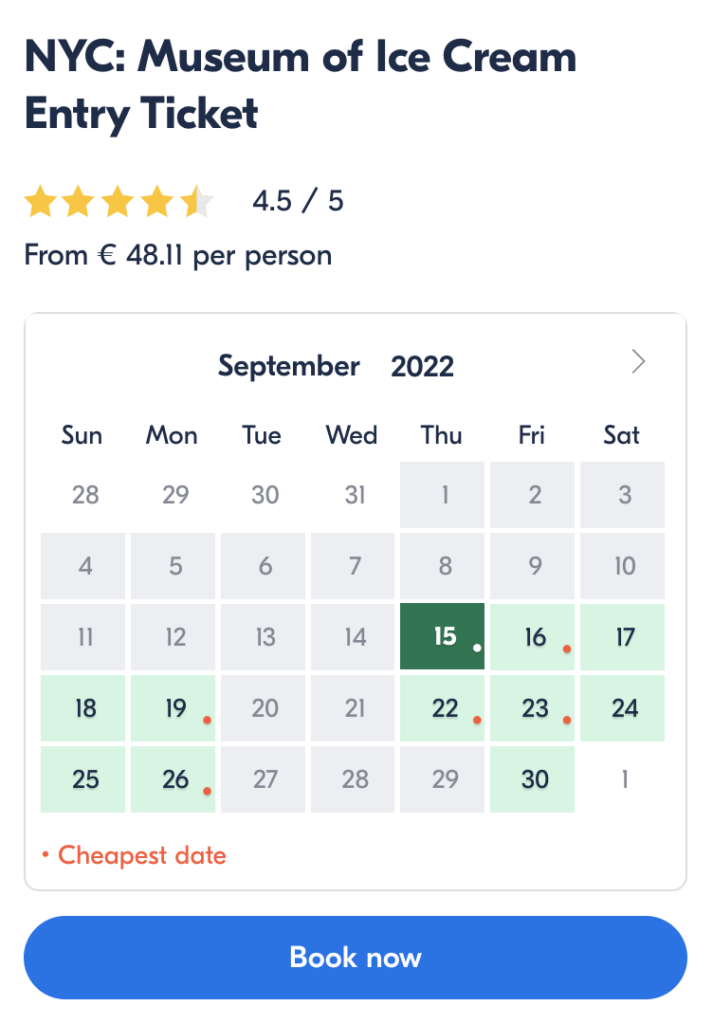
An availability widget is an information widget that groups information from the brand’s website. Such widgets help travelers choose the right brand offer from the available options at the best price.
An example of such a tool is the GetYourGuide availability widget, which shows the availability of tickets on a specific date and highlights cheap dates.
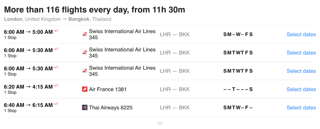
Another example of an information widget is the useful schedule widget from the partner program of the WayAway flight aggregator. This tool will help users find a flight ticket that fits their specific time of arrival and departure.
In the widget settings, you can select the city of departure, arrival, and specific airline. All that remains for travelers is to press the “Select Dates” button and buy a ticket.
Offer Widget
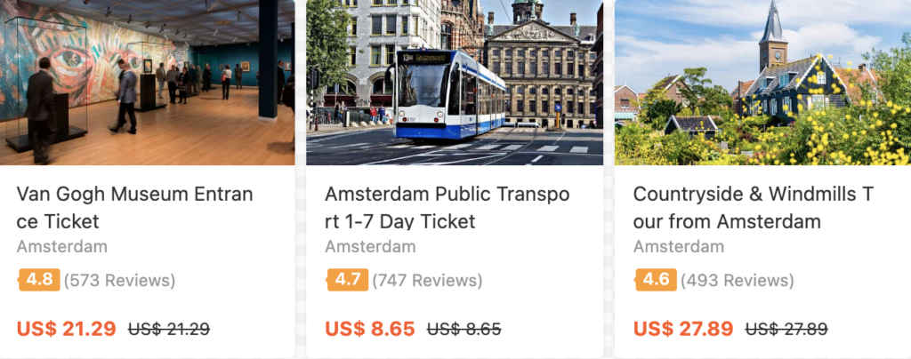
The product widget helps users compare several offers from various brands and choose the best option. For example, tickets to sights that they can buy on Tiqets. In the settings of this widget, partners can decide which offers to display.

Offer widgets can be dynamic. This means that the content of the widget changes depending on changes in the brand’s offer.
For example, if your audience is travelers looking for discount tours and activities, integrate a dynamic widget from Klook into your website. The list of brand offers in this widget will vary depending on the appearance of new promotional activities.
Reviews Widget
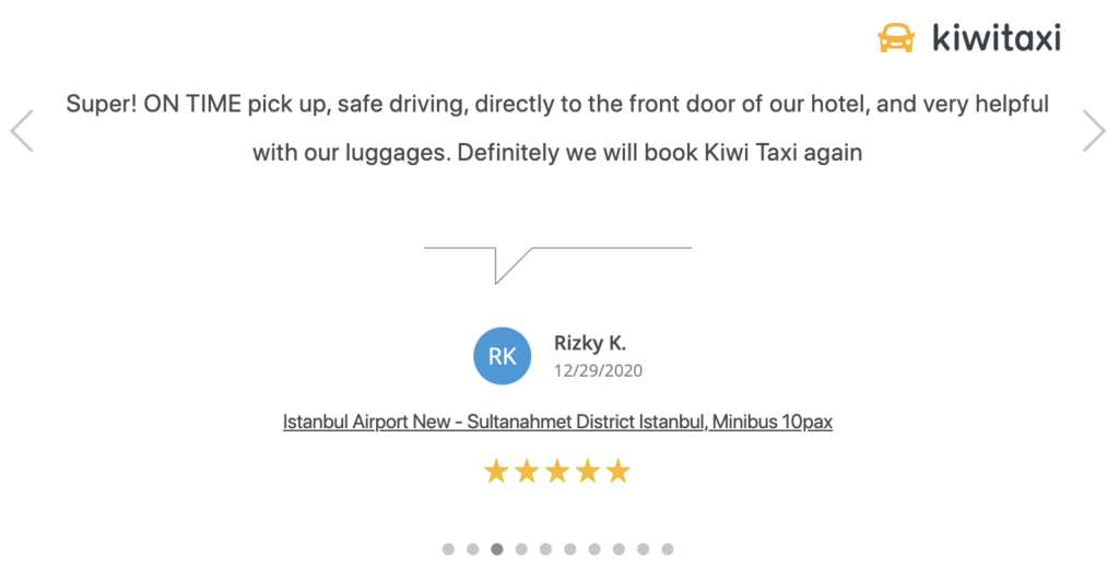
The feedback widget groups user feedback about a specific service and displays it on your website.
You can find such a widget in the KiwiTaxi partner program. Simply select the place of departure and arrival or the entire city. Your page will then display reviews of travelers who used the transfer from this brand.
Use this widget to rid your audience of doubts and encourage them to book the service.
Map Widget
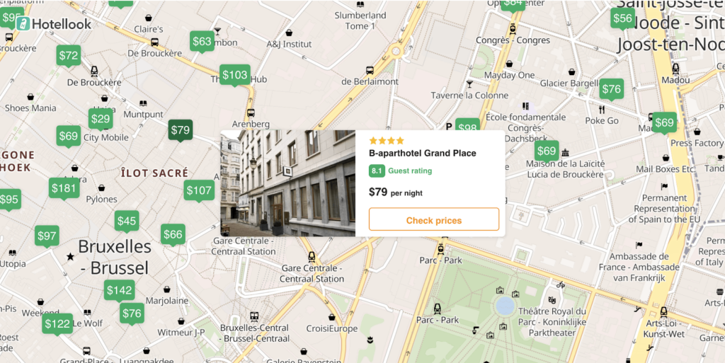
Another widget that will help your audience organize their trip and choose the right offer is a map widget.
For example, there is one on the Hotellook partner program. The interactive map features accommodation markers. When a user clicks on the marker, a hotel card appears with a rating and average cost of living.
This widget is native, increases user involvement, and helps them select and immediately book an accommodation.
How to Integrate Widgets on Your Project?
- Join the right partner program. You can use a brand’s widget if you have joined that specific brands’ partner program. All partner programs in which widgets are available can be found in the “Programs” section in your Travelpayouts account using the “Tools” filter.
- Set the widget options to the left of the screen. Specify your project, add your SUB ID if necessary, and set all other necessary parameters, such as the widget language and displayed currency. Pre-fill the widget fields and think about displaying your referral link. Follow all changes made to the widget displayed on the right side of the screen in preview mode.
- Copy the widget code at the bottom of the screen via the “Copy Code” button.
- Paste the widget code to your website.
The widget code contains all settings as well as your partner ID and SUB ID (if you specified it). This means that you’ll be rewarded for all bookings made by users via your widget. Join the partner program to work with widgets and integrate this tool on your site or blog.
10 Tips on How to Efficiently Place Widgets on Your Project
1. Supplement the Widget With Not Only a CTA, but Also a Description of Your Own Experience
Travel-interested readers enjoy posts describing your experience with specific services. So, try to add a CTA (call-to-action) before the widget, but also create appropriate content around it.
For example, if you want to recommend buying cheap tickets on WayAway, you can tell your audience how much you saved with this aggregator.
2. Make Widgets Native
When using any partner tools, use logic and don’t impose products or services on readers. They must come to the decision to make an informed action on their own regarding buying tickets, booking a hotel, etc. So, you’ll want to put a widget where you think users will take action.
A page with only a widget on it might be a quick and easy way to earn with partner programs, but context is very important. The context of your content around the widget will not only encourage your audience to book a specific travel service, but will also help your page ranking on search engines.
3. Pay Attention to the Analytics Systems Data
If you’re looking for pages on which you can place widgets, pay attention to analytics systems data.
Pages with high organic or paid search traffic are viewed by the users most interested in your content and the services that you promote on the page. These high rates mean that users have found your pages from search engines via keywords and thus have a high intent to make a purchase.
But be careful with the homepage. Most likely, your main page has high views. The problem is that users land there from Google search. Your homepage is the starting point for your readers. However, most visitors probably have no intention of buying any travel service yet. So, try to place widget on high-traffic, but more narrowly focused pages.
If you’ve already used widgets in the past, look at the page statistics of your project. For instance, a widget is clearly more effective if you place it on pages with a low bounce rate or a high average time on page.
4. Find the Right Location for Your Widget
Widgets need not be placed at the beginning or end of the page. Choose a place according to your content and make a logical line in the text to avoid “banner blindness” (when users don’t notice ads on a site and, thus, don’t interact with them).
Advertisements on the front screens may not be visible to the readers at all if something goes wrong and the page is not fully loaded.
Widgets in the sidebar usually don’t convert well because most readers go to the site from smartphones. In this case, the sidebar is transferred to the main content and no one sees it.
So, try to place widgets in the middle of a post or even further in the text.
5. Fill in the Widget Depending on the Context
Fill in widgets according to your content. If your audience is closer to buying, this is a great approach since users will only have to follow the link and book a brand’s service.
For example, if you describe how to travel from the airport to a hotel in Rome, mention that it’s possible to rent a car and place a widget that allows users to do so.
6. Don’t Overdo It With the Number of Products
Don’t overdo your list of offers. If, in the post, you talk about two specific excursions from GetYourGuide, don’t add eight others to the widget. Just add mentioned excursions to the widget.
This tip also applies to the map widget. If, in the post, you share how to have a cheap holiday in Amsterdam, zoom in on the area with the cheapest accommodations, but don’t shut off the functionality of the zoom feature so users can still zoom in or move the camera to another area if they would like to do so.
7. Determine the Optimal Number of Widgets per Page
Pay attention to the number of tools. Try to start with one widget per page. It’s important that widgets don’t compete with each other or confuse the audience. After all, widgets are there to help them choose the best offer.
8. Use Widgets Together With Partner Links
Use a combination of partner links and widgets. Readers can choose a convenient option and book the service themselves.
In addition, if something goes wrong and the widget doesn’t load, you’ll have a duplicate partner tool and will not lose a booking.
9. Make Sure That Your Widgets Look Good on Mobile
Most users book travel services from mobile devices. As a result, it’s important that widgets are displayed correctly on all devices, so you don’t miss out on any bookings.
Widgets of all Travelpayouts brands are customized for mobile devices with different screen sizes. Make sure that the tool is displayed correctly when you are publishing any page with a widget.
10. Experiment
You have to experiment to see what works for each post, page placement, destination, and audience. Try widgets from different partner programs, test different types of widgets in your project, and combine them with other partner tools. With flexible tool settings, you can even change the appearance of your widgets. For example, choose different colors to make the tool more in line with your brand color scheme.
When testing widgets, specify the SUB ID so you can track the performance of each tool using the reports.

