Available tools
Travelpayouts provides an opportunity to earn on flight tickets, hotel bookings, train and bus tickets, excursions, and other travel services with well-known brands.
You can use the following tools for integration into your project:
- Search forms
- Widgets: maps, calendar, best deals, and others
- Hotel maps
- Text links
Each Travelpayouts partner program has its own set of tools. You can find the list of available tools in the “Tools” section of the partner program page or in our brands directory.
How to use
Even the same solutions show different results depending on the situation. The method of identifying the best option for you is to try everything, carry out experiments, and select according to your experiences about your own website. Below are the secrets, tips, and observations, collected on one page to save you time. However, be creative, imagine your own way of working!
Text links
In pursuit of beautiful and convenient search forms, as well as other interactive tools, e.g., widgets, you can accidentally forget about text links. Webmasters often underestimate the power of hyperlinks in the articles.
Not all visitors use widgets and search forms. It can happen for many reasons. For example, a person came from a mobile device or simply perceives such elements as advertising, and not reacting to them. Hyperlink is what most internet users are used to and what is absolutely displayed on all devices correctly.
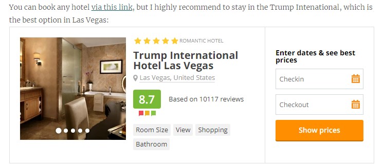
Text links can be used as an independent and unique affiliate element on the page and as an additional one to other elements. For example, webmasters can use widget + hyperlink in the text. Sometimes, such combination works better. An example of such use includes:

The visual design depends on your site. It will be better if the reader immediately understands that there is a hyperlink in front of him. For example, highlighted with color and underlined text.
Search forms
Search forms allow users to find flight tickets, hotels, and other products according to specified parameters. Without visitors, such elements provide no information. They are simply a tool to display results once a specific action has been made. On the way to finding information, the user will perform additional actions, such as typing in the names of cities, choosing the dates when they will be flying, and so on.
If you can predict the needs of your users, it is worthwhile to set default parameters. For example, in an article about flight tickets from New York City to Hong Kong, it is logical to auto-complete these locations by default. Such features are available in both flight and hotel forms:

If you fail to predict the needs of your visitors, they can simply delete the data and customize the request on their own.
To get detailed statistics, use the SUB ID, which is an optional parameter that helps you track clicks and sales separately for each source of traffic or tool.
For example, for search forms added to articles about travel to Hong Kong, you can specify the “hongkong_travel_post” SUB ID. To find out which content the search forms have worked better in, group the report by SUB ID filter ( “Reports” → “Summary” in your Travelpayouts account). Read more about the SUB ID in our help center.
Map Widget for Tickets and Hotels
A distinctive feature from the search form is the map widget, which provides information to visitors, such as displaying prices and offers. This widget is an interactive element where information will be automatically updated without your participation. The map widget from the Hotellook partner program looks like this:
When using the map widget, don’t disable zooming. Keeping the zoom feature intact makes the widget more convenient to use, as users can zoom in on the map or move the camera to another district.
If you want to help travelers who are unfamiliar with the city, it’s a good idea to initially narrow the scope of hotel offers. Remember that a common problem for many tourists is that they don’t know where to stay. To increase your own income, solve this problem for them. For example, you can recommend an optimal location based on the visitor’s travel destination:
Other Widgets
Some brands also have other widgets available.
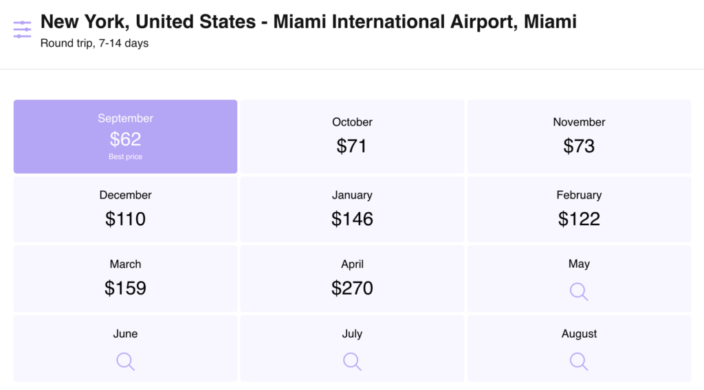
The calendar widget will acquaint the traveler with the prices. In popular areas, this widget works well, but it may not be as accurate for less frequented destinations.

The results are generated on the basis of searches. If there were no or few searches, data would not be enough. Before embedding, also study whether the technology works in your destination or not.
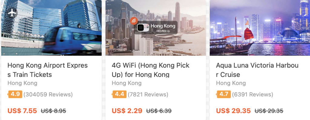
The best deals and special offers widget is suitable for pages where dynamic content is needed. Place an element with information about sales and discounts if your project has the appropriate traffic. Focus on the features of the audience.
Offering cheap travel services and discounts is a great way to attract audiences. However, if the visitor is initially interested in sales in a particular destination, this is different. Your task is to give the visitor what they came for, otherwise, they will not take it and you will not have a sale.

How to design the elements
There is no universal answer. Ideally — to test and identify the optimal solution for design and placement. Most of the tools are available for customization — size, color, additional information, and other features. While customizing, follow these guidelines:
- It should be comfortable to look and use all the elements;
- The visitor must understand what will happen after the click;
- Traffic patterns should be considered from PC and mobile devices.
Hyperlink style must be different from the rest of the text; otherwise, it will be invisible to a new reader. If it is a form, then it should fit nicely into the design. A confusing and provocative design is justified in very rare cases.
On some elements, there are Aviasales and Hotellook logos that you can hide. Sometimes, it is better to hide, and sometimes to keep them and solve it by your own case. These are well-known brands, and their presence adds clarity to the user on what will happen after the click. And this clarity is very important; remember, you rarely click or use a formed purpose of which you do not understand. Here is the same logic.
Where to place
It is not necessary to make a search form at the beginning of the article in any case, and only then give the reader useful information. In the worst case, the users won’t use the tool, and moreover also close the site, which will affect the behavioral factors and can be a reason for losing position in Google.
The best place is as high as possible, but just integrate the tool in a place where the reader will need this tool. To do this, look at your own page through the eyes of a stranger. In addition, as one of the tips on how to write quality articles, the page must give a profit for the reader. The affiliate tool should complete the usefulness of the material for the reader. If not, then you chose the wrong place or wrong tool.
If the form or other element is the main component of the page, then remember the rule of the visible part of the screen. Place the block where the visitor can reach it without scrolling down. Here, the question is not only the design of a specific Travelpayouts’ tool, but the entire site.
What to choose
The choice of tools affects your income. Therefore, it is so important to consider the issue of customization and placement with a professional approach. For this:
- Use additional markers to track and analyze statistics;
- Conduct experiments and be creative;
- Study the features and capabilities of the tools;
- Do not miss the Travelpayouts newsletter, it introduces the new opportunities.
There are also ready-made solutions for mobile applications available, such as Travelpayouts SDK and free API. Some brands, such as DiscoverCars, Kiwi.com, Aviasales, and others, also provide their own API. Read our post to learn more about this tool and find some project ideas. API is the most flexible tool. You can also take advantage of the efficiency and convenience of White Label, which is available on KiwiTaxi, Hotellook, Localrent.com, and other partner programs.
Take time and learn about the features of Travelpayouts. Try in real practice all tools and identify the best solution definitely for you. For questions and difficulties, please contact support or study our wise knowledge base.


