What Is an Affiliate Widget?
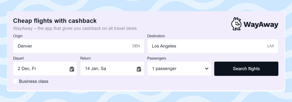
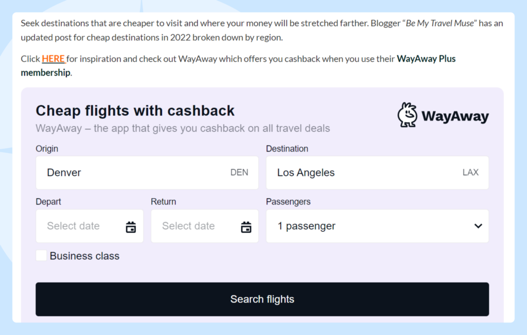
In short, a widget is a module that can be integrated into a webpage to display data. Such modules allow users to get additional information or interact with forms. For example, visitors can use a widget on your website to search for tickets by selecting their destination and travel dates.

There are fewer opportunities to use widgets than there are to use links; however, widgets also provide great conversion rates. Widgets can be placed on blogs and websites that support external codes. For example, if your blog runs on WordPress, you can easily integrate widgets inside your article.
Customer Journey When Interacting With Widgets
There are three main stages of the buying process:
- Users find and land on an article in your travel blog
- Users notify and interact with a widget on your blog
- Users buy travel product and you earn profits
To ensure the success of the buying process, you need to check that your widgets are performing properly at every stage.
Choose the Right Articles in Which to Embed Widgets
Find articles that are frequented by users with high intent
It may be tempting to only place widgets on pages with the highest pageviews, but it’s important to understand why a specific page attracts a high volume of traffic. For example, many visitors may land on your homepage from a Google search. Most likely, your homepage is a starting point for your audience before they navigate to a specific blog post or travel guide
Therefore, we recommend that you place widgets inside all articles with higher traffic, as well as those that are searched for by users with high intent.
To determine if a specific article is searched for by users with high intent, use the expert-validated benchmark of 200 views from buyer keywords per article. For example, the article in question may be about specific locations or holidays. Usually, such articles are not placed on the main page since their scope is too narrow and specific.
Look at historical data and web analytics
When deciding where to place your widgets, you can use your historical website data to help inform your decision. Follow previous success by focusing on pages with a lot of newsletter sign-ups or previous conversions. Pages with an above-average time on site or low bounce rate indicate a captive audience, which will prove useful for earning commissions from your widget.
Choose the Right Places for Widgets
Don’t add widgets to the top or bottom of a page or in the sidebar
Visitors might not even pay attention to the sidebar due to “banner blindness”. If your widget is placed at the top of the page, there are two potential problems: the widget is still loading by the time the users have already scrolled down or users don’t understand what the widget is.
Put widgets where users are ready to search for travel products
It’s better to place widgets in the middle of a blog post or even further in the text. However, do not place your widgets at the very end of a blog post. Instead, choose a location where users already have enough context to understand how to interact with the widget and why they would want to do so.
Add a context
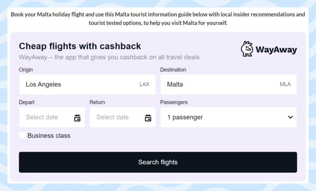
Having content on your page that pairs with your widget will help provide relevance and keep users on the page. In this case, the user expects to see a widget and, therefore, pays attention to it. A widget without context can be perceived as a banner ad, which may lead to banner blindness. In such cases, the widget may not work.
Adding additional context to why you’ve featured these products will not only help provide relevance to your audience, it could help your page rank better with search engines.

Don’t place too many widgets on the page
We recommend using up to two widgets per page as an optimal number. This will ensure that your page doesn’t look cluttered and that your widgets do not compete against each other. If you want to highlight our product inventory throughout a page, we recommend using our affiliate links solution, which can be used in conjunction with widgets.
Make Sure That the Widget Is Optimized and Works as Planned
- Make sure that you are subscribed to the partner program of the brand whose widget you are using.
- Make sure that your widget is visible and looks good on both the desktop and mobile versions of your website.
- Check that all the clicks and bookings are tracked to your statistics. For example, you can make a test booking by yourself.
- Always fill in the widget depending on the context. Users should not be left with an empty search form for flight tickets or transfers with the expectation that they will fill it in themselves.

- Choose the ideal number of products to feature. Some widgets offer the option of filling in anywhere from 1 to 30 travel products. Strike a balance between how many products is too few and how many is too many to feature in your widget. Too few options might not provide enough variety, while too many options might overwhelm visitors.

How to Understand if Your Widgets Are Placed Correctly
Unfortunately, we cannot give you a personalized checklist that will guarantee you’ve done everything correctly. Every project is unique and even different pages for the same project will lead to different conversion rates.
Even though the tips that we’ve shared here are universal, there are still many details that you’ll need to figure out on your own. Constantly analyze your project, look for a decline or increase in conversions, and try to understand the reasons behind these changes. If 1,000 unique readers visited a page with a widget, but you didn’t earn a single sale, it makes sense to read these recommendations again.


