Types of Search Boxes and Forms
There are three main types of search boxes and forms. We know that they all have the same goal: to get a user to the page they’re looking for. The question is how visitors see this form and how they use it. Let’s start with UX/UI design.
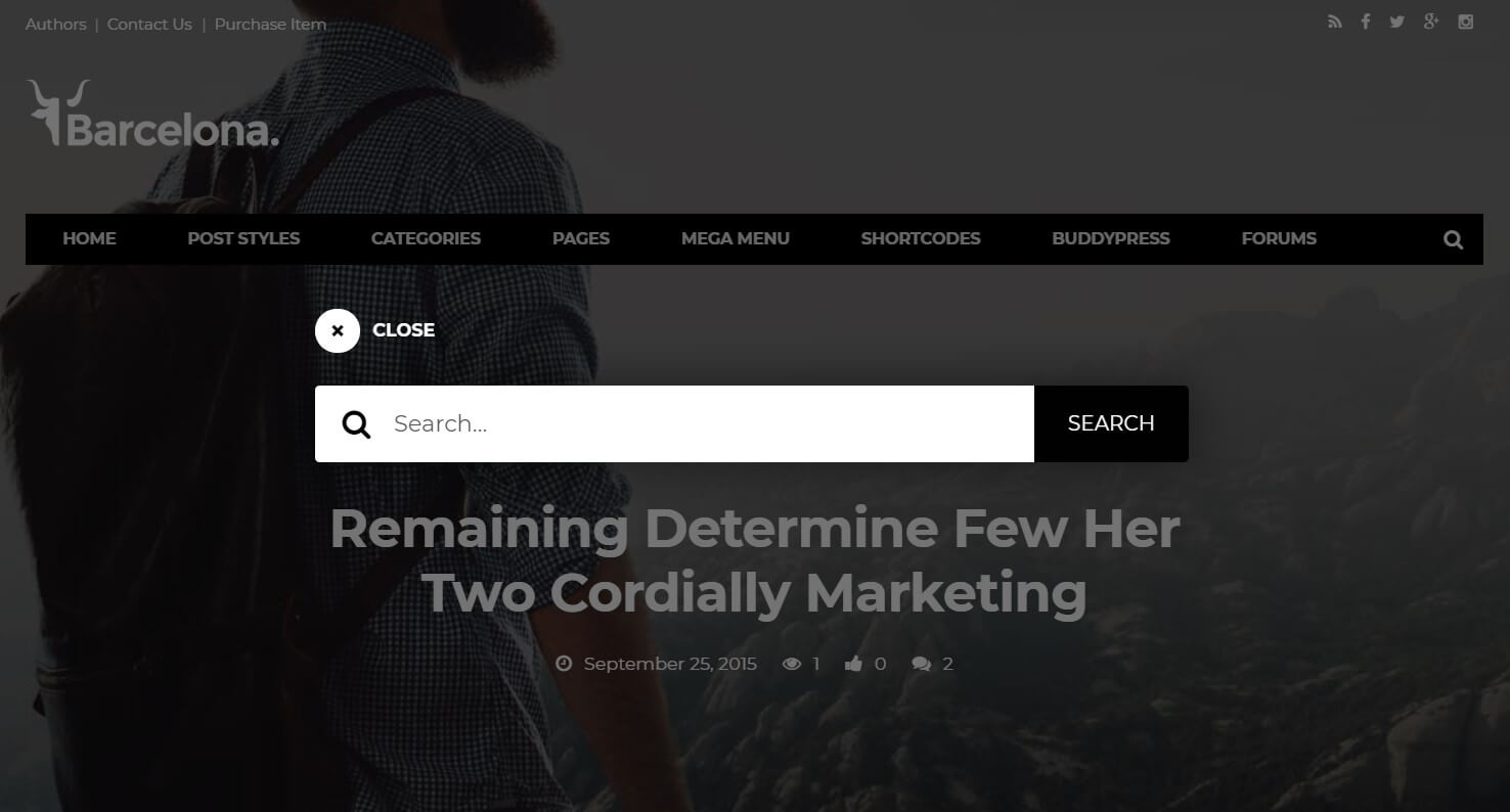
Modal Search Window
Modal windows are not new on the web and can be used for different purposes, including a search feature. Usually, modals draw people’s attention. In our case, there is no exception. After clicking on the button, users see and focus only on search options. It might be helpful when you have a complex process with several options from which to choose. However, it’s not always this way – see the example below.

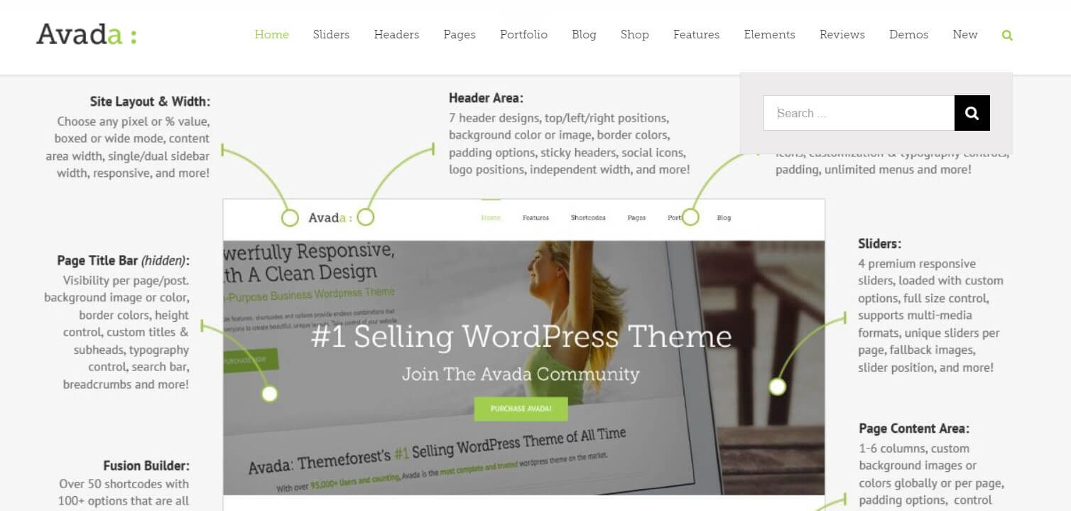
Inline Search Form
Inline search is very simple and understandable even for amateurs. A search box won’t pop up on the screen but remains part of the interface. The box can be there all the time. There’s no need for excessive clicking, as it is always on the top of the screen. Or a form may appear after one click on a certain button on the screen, but it won’t be as noticeable as modals.

Autosuggestion
Autosuggestion was first used by Google, and look how far we’ve come since then. A creative approach toward autosuggestion can massively improve conversion rates of many websites. For example, you’ve seen simple inline search, but add some icons and info to the search results, and user experience improves 10 times.
All in all, the most important trait of any search box is clarity. Some visual elements we perceive intuitively; that’s why designers add a magnifier icon next to the box or simply the word “Search”. Gathering all this information, Travelpayouts created perfect boxes for your website. Let’s look at them a little closer and check more details about search box optimization.
10 Tips to Increase Search Form Conversion Rate
Our experts know enough tricks to make a search box work for you. We’re giving you the basic information here, but we’re open to discussion and will answer all your questions.
Tip 1. Don’t Hide the Search Box.
This is quite a simple tip, but we’ve placed it on the very first place, as it’s very common. Remember: Do not hide the search box. Users who want to find something don’t have to search the search box.
If you don’t know where the best place is, run a test, but never hide the form. An easily reachable form is the key to success.
Tip 2. Set up Conversion Tracking for Search Form Conversion Rate Optimization.
With a tracking tool, you will know what people look for most often, what fields they use, and what place the search form takes in their journey. Here are some examples of tools you can use:
Tip 3. Set Up Visual Submission Tracking
With this kind of tracker, using video representation, you’ll be able to follow the user’s every step. Visual trackers show you an online user experience – what actions users undertake and in which order. You’ll always be aware of the average search form submission rate and know how to improve it. The instruments to use in this case are Yandex Webvisor or Hotjar.
Tip 4. Place the Form Above the Fold
Though your form will be quite large, you shouldn’t put it at the bottom of the page. On the contrary, you must show people that searching for something on your website is easy. The search form conversion rate will be much better when you place the form above the fold.
Tip 5. Use Best Practices for Search Form Conversion
There are several simple facts about form conversion that any website can apply. Though this knowledge is accessible to everyone, there are some mistakes that website owners make every day. Let’s discuss the best practices for search form conversion from the perspective of the travel industry.
- Keep the form as short as possible.
- Include testimonials, proof from social networks and SEO ranking to increase users’ trust.
- Be very careful with using CAPTCHA because many people see it as a frustrating element. It can reduce the average search form conversion rate.
Tip 6. Make the Process of Filling Out the Form Smooth and Easy
To create a pleasant experience for a user planning a trip, follow these rules for the search form’s fields:
- Use one-line fields, autosuggestion and autofill.
- Mark mandatory fields.
- Include optional questions at the bottom of the form.
Tip 7. Use a Catchy Call to Action
The CTA of your search form should stand out and be attractive to a user. Consider everything: font, color, placement of the button and the phrase itself. We suggest using colors that differ from the overall color palette of your website.
Tip 8. Split Testing Is the Key Search Form Testing Tool
Still unsure about where to place the form? Split testing (also called A/B testing) is the most effective way to determine whether the above-the-fold approach is the best option in your situation. Results of the test can help improve the overall landing page conversion rate.
Tip 9. Test the Search Form’s Flow
When the box has been implemented, it is important to check on whether the system correctly understands requests. Lots of search forms on the web lead the user nowhere. In our case, “nowhere” means no information about the destination point – a flight and a hotel.
Tip 10. Let Users Try Out the Form
You already have a visual submission tracker. Use it first with a small group of users (about 5 people). It is safer than letting your form go into freefall and fixing bugs along the way. You can also gather reviews about the form’s look: its color, placement and fields, and a CTA button.
How to Improve Search Box and Form Conversion Rates
With a huge number of travel portals on the market, paying attention to every detail on your website is a necessity.
Search boxes can become the antagonist in your business novel, but we won’t let this happen. The tips we’ve described seem simple and easily enforceable, but they swiftly increase search form conversion rate.

