What Is a Call to Action?
Calls to action, or CTAs, are pieces of text that prompt your prospects to take action in regard to your blog. Most often, it’s a button and/or a link directing the user to another page.
They’re an excellent approach to keep your audience involved in order to foster a sense of community, loyalty, and increased interest in your services. CTAs might direct your audience to different services, pages, or social media platforms, inviting them to connect with you there.
Why you need a call to action in travel
What is a CTA in travel? In travel blogs, you will want your prospects to book tours and vacations from your blog or on the website of the brand that you promote.
A good call to action for articles will inform readers on what they need to do after reading your content and entice them to actually click the link. Yes, great text and stunning photography do the grunt work, but it’s your call to action that seals the deal.
Without CTAs, users are more likely to leave a page feeling lost or wishing for more information but unsure how to discover or obtain it.
Best Practices for Travel Blog Ctas
What is a good CTA? It will explain what the users will get by taking an action and entice them to click that link. Below, we offer eight best practices on how to create an efficient call to action in blog posts.
1. No risk statement
Your call to action should be a low-risk statement. Ensure users that they risk nothing by clicking your link. It’s very important to explain to the audience what exactly happens after they click your link and dispel any doubts.
For example, for a CTA enticing a booking, you can indicate that visitors won’t pay anything by clicking the link. You can also get creative about the CTA text. For example, instead of “Book” use “See the tickets” or “Check the details.”
By creating low-risk calls to action in blog posts, you’ll make visitors more likely to click the link as their doubts will be addressed.
2. Be Clear
Your CTA button needs to be crystal clear in what it offers. The visitor must distinctly understand what they will get by clicking the link. It will reduce friction, as the user won’t waste time by thinking about what the link means and whether it’s the right button.
Thus, for a call to action button that invites users to make a booking, you should clearly state so. For example, “Book now.” And for the button that sends the user to the advertiser’s page, you can use the “See the tickets” button, and so on.
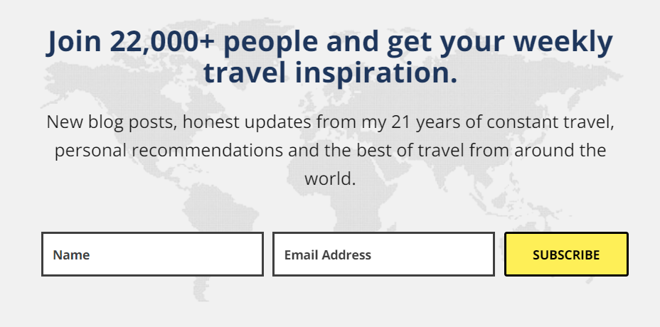
Another example is from the Wandering Earl blog. Users can read exactly what the newsletter offers.
3. Show immediate benefits
To entice the user to click the link, you need to show exactly how it benefits them. People will not click your CTA button if they are unsure about the value it provides.
For example, you can indicate that by clicking the link the user will see the cheapest tours from the advertiser. Or that by subscribing to your newsletter, they’ll always be updated on your new blog posts and best deals.
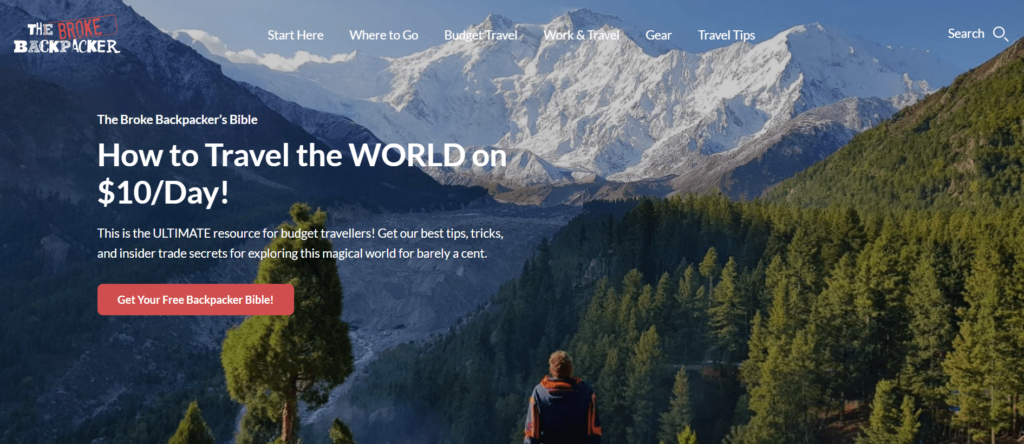
The Broke Backpack distinctly explains the benefits for users to check out the offer.
4. Use action language
To entice visitors to take action, it’s efficient to use action language. Best of all, try action verbs such as “Book,” “Subscribe,” “Learn,” and so on. Simply put, the wording you use in your call to action should direct users to the next step.
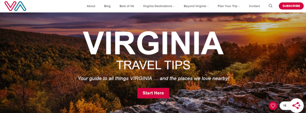
One great example is Virginia Travel Tips with its concise “Start Here” button.
5. Keep it short
Ineffective CTAs are those that are excessively long and wordy. It’s best to make your text brief and sweet, and to the point.
By keeping CTAs to four words or less, you are increasing the chance of your lead conversion. Strong verbs can help you make the most of your limited word count. “Get started,” “Learn more,” “Join free,” and “Purchase now” are some instances of short, standard CTAs that function well because they are clear and give no room for doubt.
6. Use bright colors
Designing your CTA travel button to stand out from the background is another proven approach to ensure that it is easily found. Using bright colors for your CTAs is a helpful practice because people will immediately point it out on the page and won’t pass by. It should also be big enough to be visible without taking up too much space.
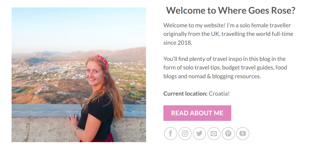
For example, Rose of the Where Goes Rose travel blog puts CTA buttons in red to draw users’ attention to them.
7. Make it clickable
Visitors must be able to click your CTA for it to be effective. Make sure to attach a link to the desired page, such as search results, subscription form, offer’s page, and so on. If you design a CTA as a button, it can entice even more clicks.
8. Place it above the fold
Make sure to position your CTA above the fold on a page to increase its chances of being spotted. Again, it’s because you want visitors to be able to find you as quickly as possible and not pass by.
Visitors may only want to give a glimpse to your offer and have no desire to scroll down. But if you place a CTA above the fold, they’ll know what the offer is about and what they are asked to do.
How to Assess Your CTA Efficiency?
Make sure to assess your CTA efficiency to find the best-performing option. In this regard, you might find helpful heatmap tools and A/B testing to discover what suits your business best.
1. Heatmap tools
Heatmap tools overlay your pages with an overlay showing areas with greater user behavior as hotter than those with less user activity. In addition, Heatmap tools will give you a visual representation of where your visitors are clicking on your page most often.
A heatmap is a graphical depiction of data that uses a color-coding method to represent various values. Heatmaps are utilized in a variety of analytics applications, but they’re most typically employed to display user activity on particular web pages, buttons, or links.
Smartlook and Mousestats are free heatmap tools that can help you assess your CTA travel button efficiency. You can find more about this tool and more free heatmap tools on our blog.
2. Test Different Ctas
A/B tests should be used on a regular basis to compare CTAs efficiency. This will show you the best-performing design, text and placement and help you understand what adjustments you can make to enhance conversion rates. Learn more about how to run A/B testing on our blog.
How to Create a CTA for Your Travel Blog
How do you write a CTA phrase for travel posts? Pick verbs to entice action from the audience, be clear about what you’re offering, and keep it short. Try to use bright colors for the button so that it’s visible on the page. Also, show the audience there is no risk behind your offer for them, show immediate benefits to entice clicks, and make sure that your button is clickable.

