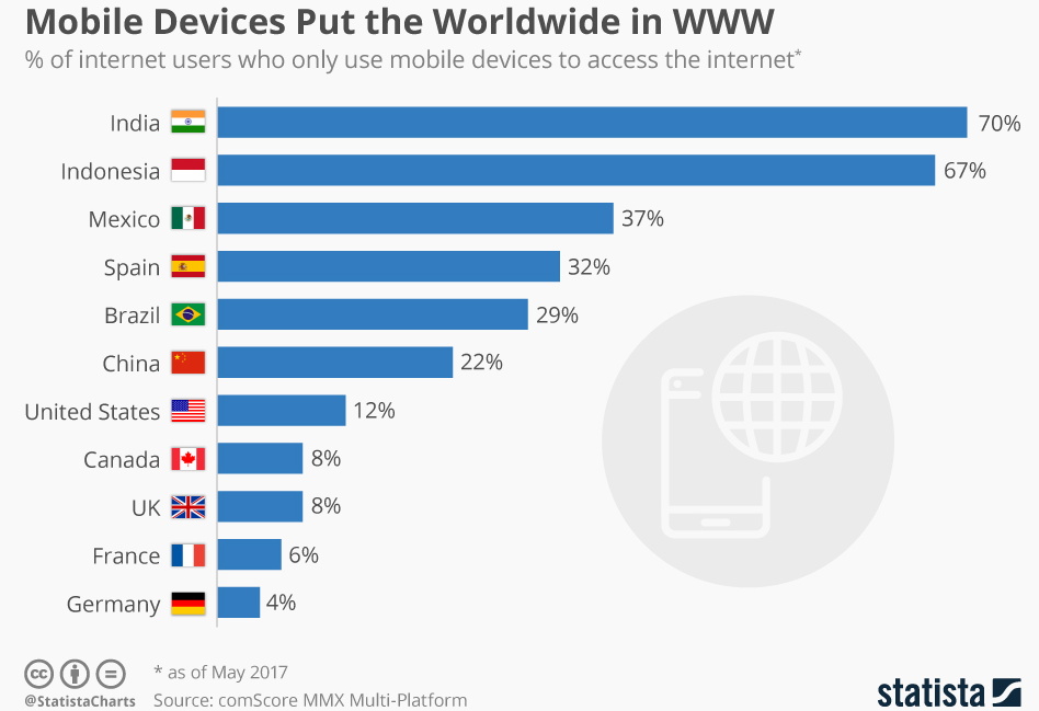
The Latest Statistics

Isn’t this impressive? And these are only the statistics for those who use solely mobile devices. The number of those who use both a laptop and a phone are higher! Think about yourself — how did you last search for something on the Internet?
How to Create a Mobile Version
There are three main options:
- Responsive design;
- A separate mobile version of the site;
- AMP — Accelerated Mobile Pages.
Use one of the methods to improve your travel blog. If the core of your website is a WordPress CMS, you can use plugins, for example, Responsible or WPTouch.
Responsive Design
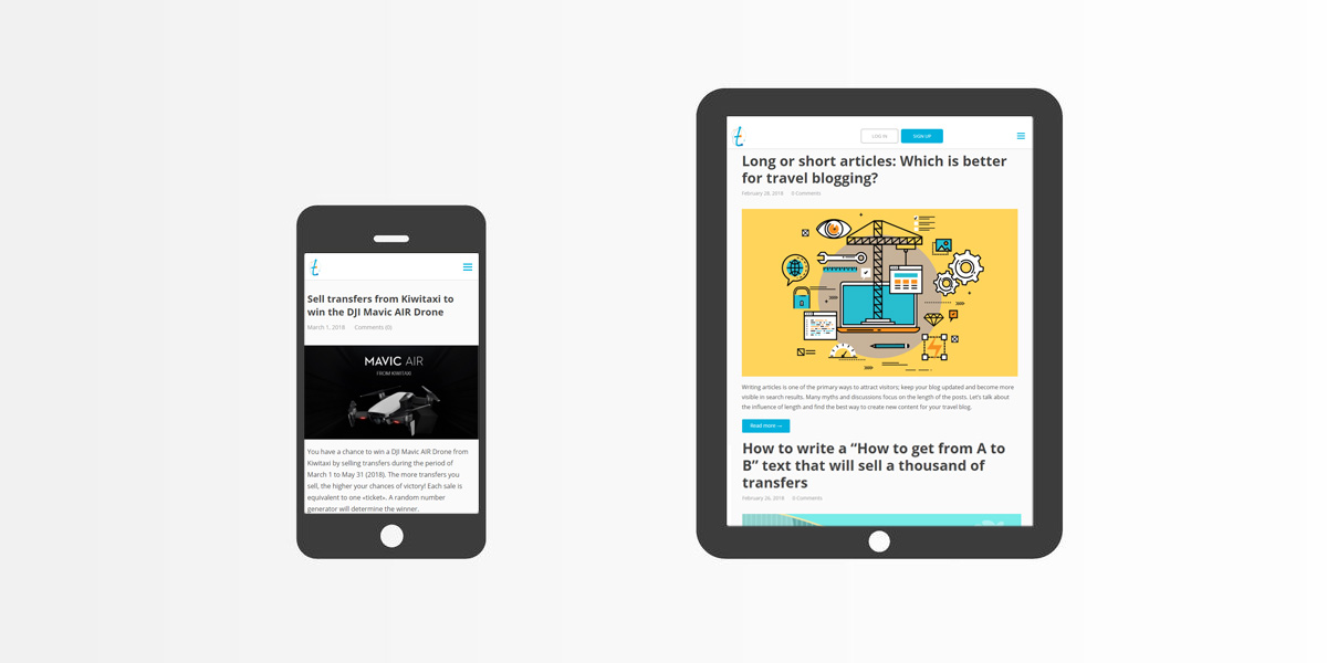
One of the easiest and most common options is an adaptive template. This means that the page is adjusted for the resolution and format of the user’s screen, whether desktop or mobile. Even our blog is based on this technology. For example:

Keep in mind that not only must your template be responsive, but also all elements. Tools in Travelpayouts are initially adaptive. This means you can embed, for example, the flight search form in any version of the site and it will work well. Most of the best flight affiliate programs have the same conditions, but in addition to travel tools, you probably use other methods to earn on travel blog, such as Google AdSense, etc. Be careful and test everything before you publish.
A Separate Mobile Version of the Site
This is gradually becoming obsolete, but is still common. A separate version means that your site is available simultaneously at two addresses:
- example.com — for desktop users;
- m.example.com — for mobile users.
You can automatically redirect visitors to the appropriate version based on the visitors’ OS and screen resolution.
This method works well if you must display significantly different information for users from different devices. However, if the versions of your blog are the same and you simply want to make them convenient for everyone, responsive design is the preferred option.
Accelerated Mobile Pages
This is an open-source project which Google powerfully supports and promotes. Technology doesn’t change websites’ template; it’s a script which is used to present information without unnecessary design. All AMP websites look similar; the difference is simply in content.
This is a good option if you are a skilled webmaster and want to have a good relationship with Google. The search engine prioritizes a mobile SERP for AMP websites.
Regardless of which format you choose, a mobile version is not only a way to make your website more convenient for a user, but is also a tool to attract more users.
Look at your website’s analytics. Likely, many of your users are coming from portable devices. If your share of such visitors is currently less than 10%, you may believe that, for such a small audience, you don’t need to improve your project. This is a popular delusion.
The lack of a mobile version affects the results in the SERP. When you do not have a mobile version, you will have few mobile users. If you improve your travel blog, the visibility of your project in Google will most likely increase as well. This should boost site traffic and simultaneously raise your revenue. Go Ahead!


