What Are Banner Ads
Banner ads are a popular form of online advertising aimed at promoting a brand and attracting traffic to the advertiser’s website. Such ads usually contain a picture and text, and they can be either static or dynamic (e.g. gif images).
The best banner ads help attract traffic to the advertiser’s website, drive sales and increase brand awareness. It is a popular marketing strategy, which accounted for ⅕ of all digital advertising costs in 2018.
Your website banner design should match the advertising model you employ to have the desired effect. For example, if you are paid per impression, make sure that all the website visitors see it.
For the cost-per-click model, it’s important to encourage the audience to click on the banner, so it should be really appealing and provide intrigue. Check out the best PPC networks that you can make money with today.
How to Make Your Banner Ad Stand Out
There are many ways in which you can design banner ads. Play with color, fonts, filters or use a plain background to highlight what the text says. Whichever strategy you employ, it should align with your brand and clearly represent your idea, without being too expository. We’ve compiled some tips below on how to design a banner ad and provided banner ad examples to give you a headstart.
Choose the Right Size
Your banner stands the best chance of success if it is the right size. Most popular banner ads are one of the following sizes:
- 728×90px — Leaderboard
- 300×600px — Half Page
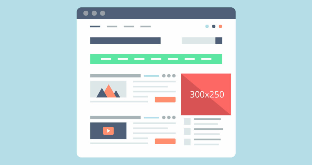
- 300×250px — Medium Rectangle
- 336×280px — Large Rectangle
Here is an example of how a medium rectangle banner looks on a web page:
To reduce your chance of being ad blocked make your banner a non-standard size.
Only show one product
The idea of advertising a few of your products at once and saving your budget might seem reasonable, but don’t let it fool you. With too many different elements, your website banner advertisement will be hard to understand.
Successful ads showcase one product only, and they take advantage of all means to make the customer notice their product. On the other hand, banners with several products cannot equally highlight all of them, one element can obscure others, and customers will get distracted.
This refers to the number of products and all the elements in general. Avoid the temptation to show too many elements, whether it’s words or visuals. Choose one message that you want to impart and focus on channeling it loud and clear.
Use the Main Elements
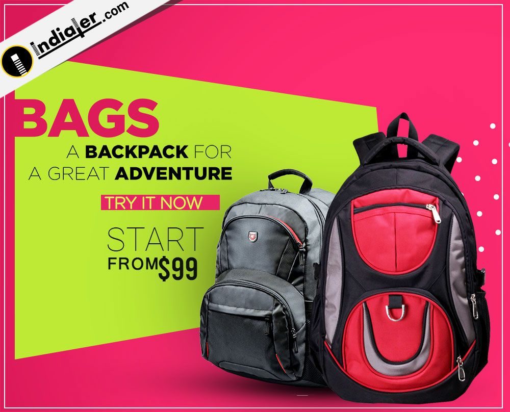
Each banner ad should have three main parts: Logo, value proposition and call to action (CTA). Respect the hierarchy and find the right balance between all elements so the client’s attention passes smoothly from one part to another.
1. Your value proposition is what you offer to clients. For example, “70% off” or “3 days only.” It should take up most of the space on the ad and/or be the first thing that people see. Many advertisers use scarcity techniques to show that the offer is limited and speed up sales. The examples below might help you find banner ad design inspiration.
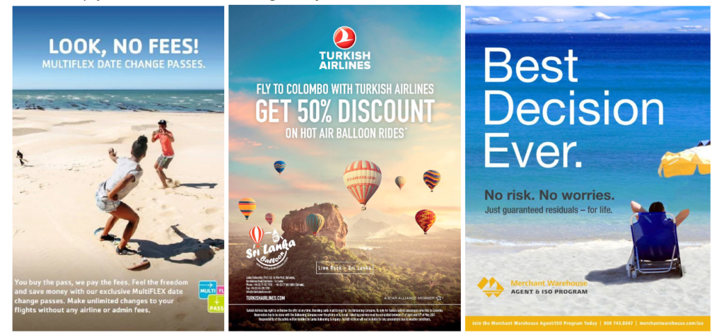
2. Your CTA invites readers to take action. For example, click on the ad. It usually includes action verbs, such as “Buy,” “Watch” or “Get your discount.” Most advertisers design CTAs as buttons and place them on the lower side.
3. The logo should be the least dominant element on the banner, so place it close to one of the edges, for example, in the upper left-hand corner. If your logo is too complicated, consider leaving some of its parts out to not overload the image.
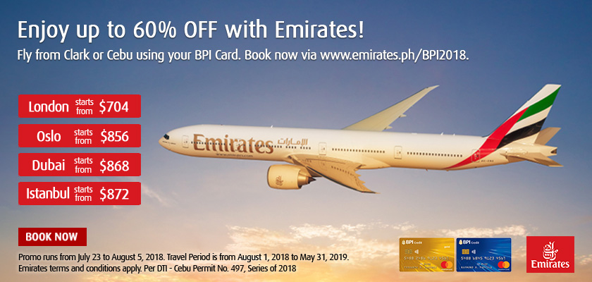
Call to Action
Why use CTAs? Almost everybody likes instructions because they facilitate the choice. They also boost conversions. Here are some ideas on how to make a good banner CTA:
- It should be clearly visible and it can even be a focal point, sometimes. Most designers present CTAs as buttons, usually in a rectangular shape
- Choose the right button size: It shouldn’t be too big or too small in regards to other content
- Button text should be clearly readable, so try to avoid intricate fonts. You should look credible and reliable
- Use personal pronouns, for example, “Register me” or “Get my discount.” Such personalization converts 202% better than impersonal text
- Give the illusion of choice. In contrast to regular one-word CTAs, adding a few extra words can reveal what users choose. For instance, “Click here to save 80%.”
Below, you can see an example of a banner with a clearly visible CTA button.

Apply the 80/20 Rule
This is as simple as it gets. Banner ads are visual art, and their main purpose is to appeal to our sense of sight and emotions. The right balance between imagery and text would be 80% vs. 20%. This will also help you channel a singular message and not get carried away. Some platforms, e.g. Facebook, use this constraint in practice, allowing you to only fill in 20% of the ad space with text. For instance, in the banner below, text occupies no less than one-fifth of the space.

Make It Reflect Your Brand
Ads not only serve to generate sales, but they also increase brand recognition. Certainly, it starts with using your company’s logo. Try to match the ad design and colors to your brand style so you don’t confuse readers. The landing page that the ad leads to should also be in line with your brand. For example, the banner ad below reflects Qatar’s violet branding color.

Choose Colors Wisely
Visuals are all about colors. To make a wise choice, try to consider your topic, product, the emotions you want to trigger and the target audience. Let’s start with the last one.
What is the average age of your potential customers? The younger generation tends to like lighter colors, while older people are attracted to darker shades.
Another point to consider is the nationality, especially if you’re targeting a particular location. Make sure to look at your design from the customer’s perspective. For example, Asian countries associate the color red with joy and happiness, while it symbolizes danger in the Middle East. Below, there are the basic associations that colors evoke in Western countries.
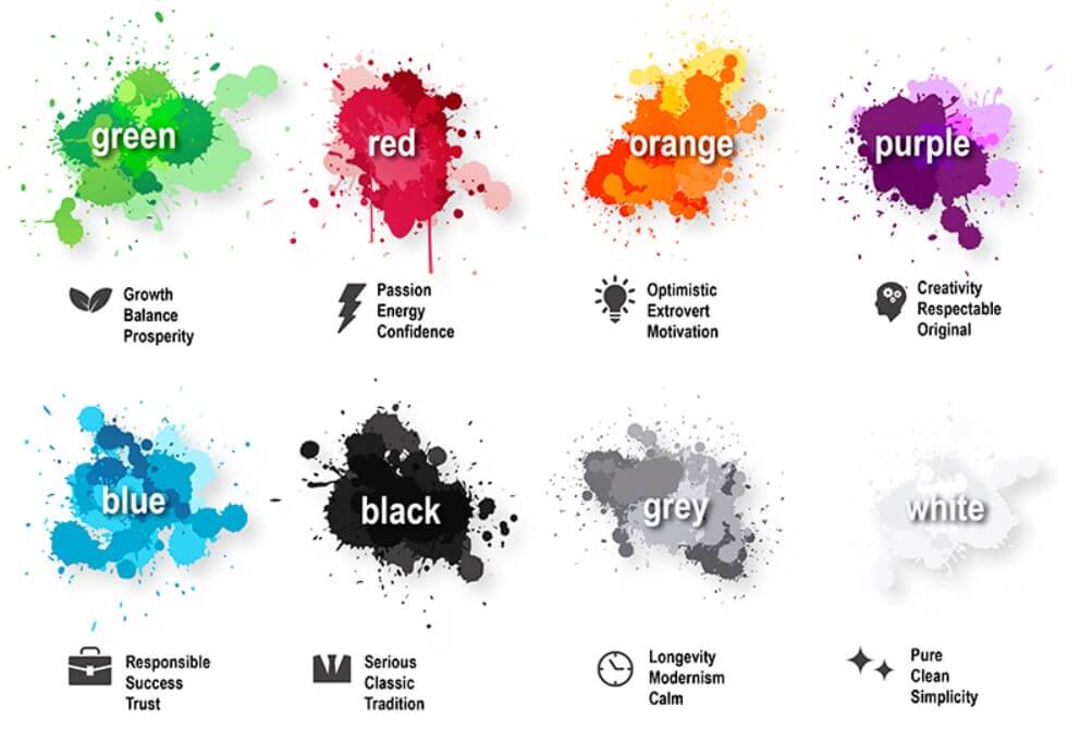
Here are some more ideas on how to design a great banner ad:
- Red appeals to most people, but it clashes with a classic message
- Orange is one of the most popular choices for buttons with CTAs
- Blue is commonly used in logos
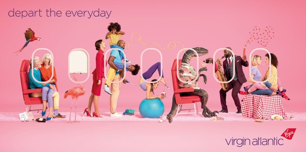
- Pink is a feminine color, but it depends on the tone and brightness
- White is perfect for channeling a sense of economy
- Black text against a white background is the most readable color mix
- Gray perfectly enhances other colors, especially when used as a background
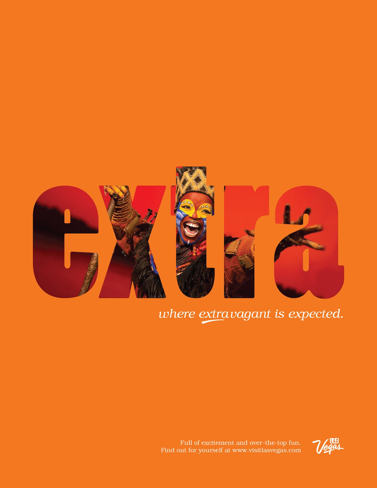
Background colors shouldn’t necessarily be muted. Brighter shades catch attention perfectly and are sometimes the best choice to look original. In the example below, the orange background perfectly channels a dynamic sense of intensity around holidays in Las Vegas.
To make sure that your ad will look nice, conduct a small amount of research on the websites where your ad will appear. This can give you valuable insights into design strategy.
How many colors can you deploy? Designers recommend to dwell on three colors with the following proportion:
- 60% — main color
- 30% — secondary color
- 10% — emphasis color
If adding a fourth color is crucial, balance it with the second color and consider toning it down with some texture.
Play on White Space
When embarking on a design journey, people tend to perceive white space as something incomplete and fill it with colors and other elements. However, you can make white space your friend. Here is why:
- White space helps focus attention on the key message. The human eye usually moves from the lightest to the darkest spots in the picture. If there is a lot of white space left, users will quickly focus on your text or design elements.
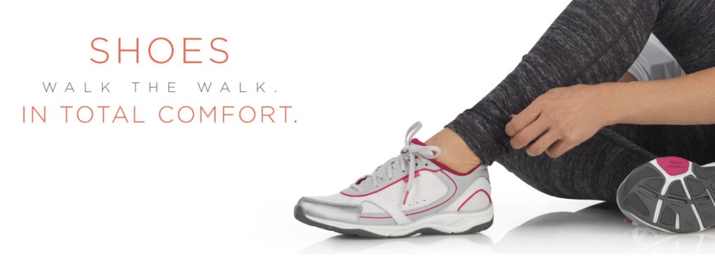
- It can also channel meaning. For example, white background is often associated with something official, silent, peaceful, classic, and if these qualities are a part of your messaging, white space could not have been more relevant. For example, the banner below uses white space to channel comfort, which is a very important quality when choosing sneakers.
Be Bold
Ads are meant to attract attention. A surefire way to create a memorable effect is through colors. A splash of daring colors creates a statement, and website visitors will have no choice but to look at your banner.
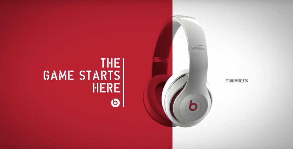
You can combine up to three bold and/or dark colors in one picture or neutralize a bold background with lighter shades. For example, white can perfectly balance out brighter hues and bring in freshness, just like in the example below.
Make the Text Emotional
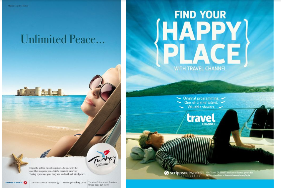
Ideally, text should take up no more than 20% of the ad space. Even though it isn’t much, words can still conjure up emotions. You can exude energy with action verbs or channel various feelings with appropriate adjectives.
Use Different Fonts
If there is a lot of text on a banner, facilitate its perception for users by deploying different fonts and/or font sizes. For example, choose one font for your headline and another one for the body. But not all typography looks good on an ad, so try to avoid:
- All uppercase letters
- Cursive or script fonts
- Letters that are too thin or too thick
- Type smaller than 10pt
Another trick to leave your competition howling is by using a custom font. It can be handwritten, created out of your product or any other way. These banners won’t go unnoticed in a sea of digital ads, just remember that custom type should be the focal point of your design.
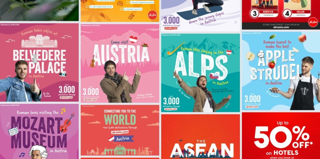
Filter Photos
With today’s sophisticated tools, you can create any impression you want. You can filter the photo, alter its color balance, add contrast or even graphic design elements to draw attention and transfer your message.
For example, Emirates has added the world’s most popular sights to its banner to create an effect of a magical journey.

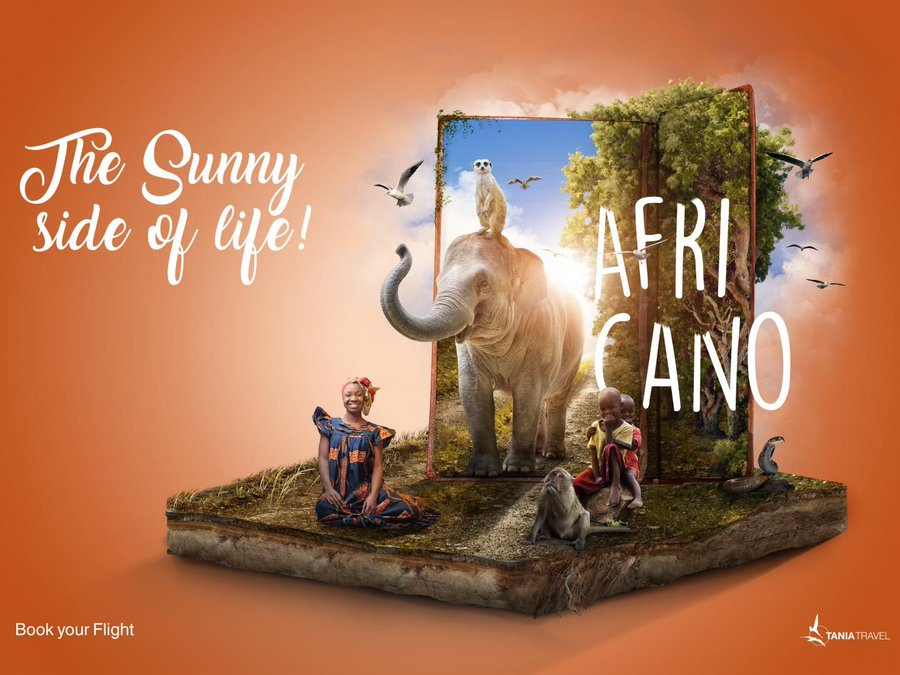
Make It Surrealistic
Another way to give a creative push to your banner is by making it look surreal or metaphoric. The key to this strategy is to catch the user’s eye with an impossible effect for long enough to make them want to learn more about your product.
Below, you can see an example of an ad that immediately draws attention with its surrealistic design.
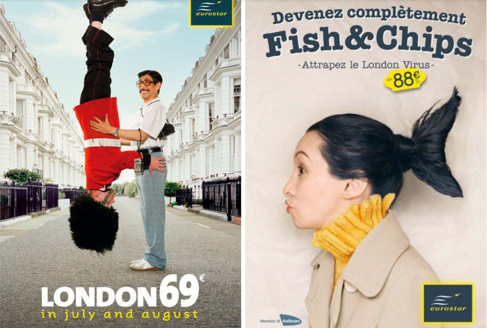
Use Metaphors
To be a winner in the advertising game, you need to come up with fresh ideas. Sometimes, it might help to compare your product to another, even unrelated concept. A good metaphor creates a memorable effect and transfers your message loud and clear.
For example, Eurostar uses metaphor in many of its ads to attract attention and create a funny effect, which it is actually good at.
Give It Some Motion
Don’t forego the chance to create a sense of movement with your ad. It exudes energy and always looks elegant, if that’s what you need. It can be flowing water, a running person, an arrow or any other object in motion.
For example, the banner below showcases a surfer on a wave, creating an atmosphere of dynamic and exciting holidays that customers can have with Wyndham Hotels.

Go Minimalistic
Keeping your design simple is essential to catching the attention of website visitors. In some ways, the less is more.
Make sure to ask yourself whether you need each design element, or it can be removed without any losses. Some parts, be it a word, color or emoji, weigh down your picture without adding real value, so eliminating them will definitely pay off.
Below, you can see an example of a SOTC’s banner ad that emphasizes the picture and uses very little text to channel the offer, so there is no redundancy.

Have a Clearly Defined Frame
Adding a frame will clearly separate your banner from the rest of the content. It also naturally draws eyes to what is inside a frame.
For banners with white background, it makes sense to add a thin gray border around the picture.

Choose the Right File Format and Size
Once the design is ready, the next important step is to format the ad properly.
Google Ads, one of the most popular advertising platforms, recommends keeping your ad size under 150 kb so that it can load fast on a web page and users don’t miss it.
The most popular ad formats are JPG, PNG, GIF and HTML5 files.
Place Your Banner Ads Correctly
The key idea is to place your banner in such a way that it is visible to readers, matches the overall page design and is still distinctive from the rest of the content.
Most designers and marketers recommend placing your banner above the top of the page so that all website visitors can see it right away. Another tactic is to place the banner close to the main page content, because that would make it seem like a relevant element.
Update Your Banners
No matter how appealing your banner is today, its novelty will wear off after a while, and it won’t create as strong of an impression as it does now.
The tactic of updating your banner ad also helps to target a wider audience, for example, the first design might have appealed to youngsters, but its second version could draw the attention of an older generation and increase sales. Finally, the offer terms or timeliness might change as well, so displaying irrelevant information won’t add to your brand credibility.
Thus, remember to keep an eye on your banners and change them should the need arise.
How to Make a Great Banner and Get More Clicks
Before designing a banner ad, try to identify your brand image, product qualities and target audience. This is the starting point that your design will be based on. Remember to stay singular in message as to not confuse customers and deploy all design elements (space, color, font, etc.) to channel one idea.
If there is a lot of competition in the niche, try to give a creative push to your design so it doesn’t get lost among a myriad of similar ads. Also, don’t overwhelm your message and work on removing details that are not crucial. Research your target audience and its cultural sensitivity. And last but not least, stick to designers’ unspoken rule: Don’t tell if you can show and vice versa.

