Clive monetized his own sites with various affiliate programs such as Omio, Booking, Tripadvisor, and GetYourGuide. After joining Travelpayouts, Clive was able to consolidate all travel affiliate programs into one account, placing widgets at the top of his monetization strategy.
Join the Travelpayouts partnership platform
Join todayWhat are Widgets?
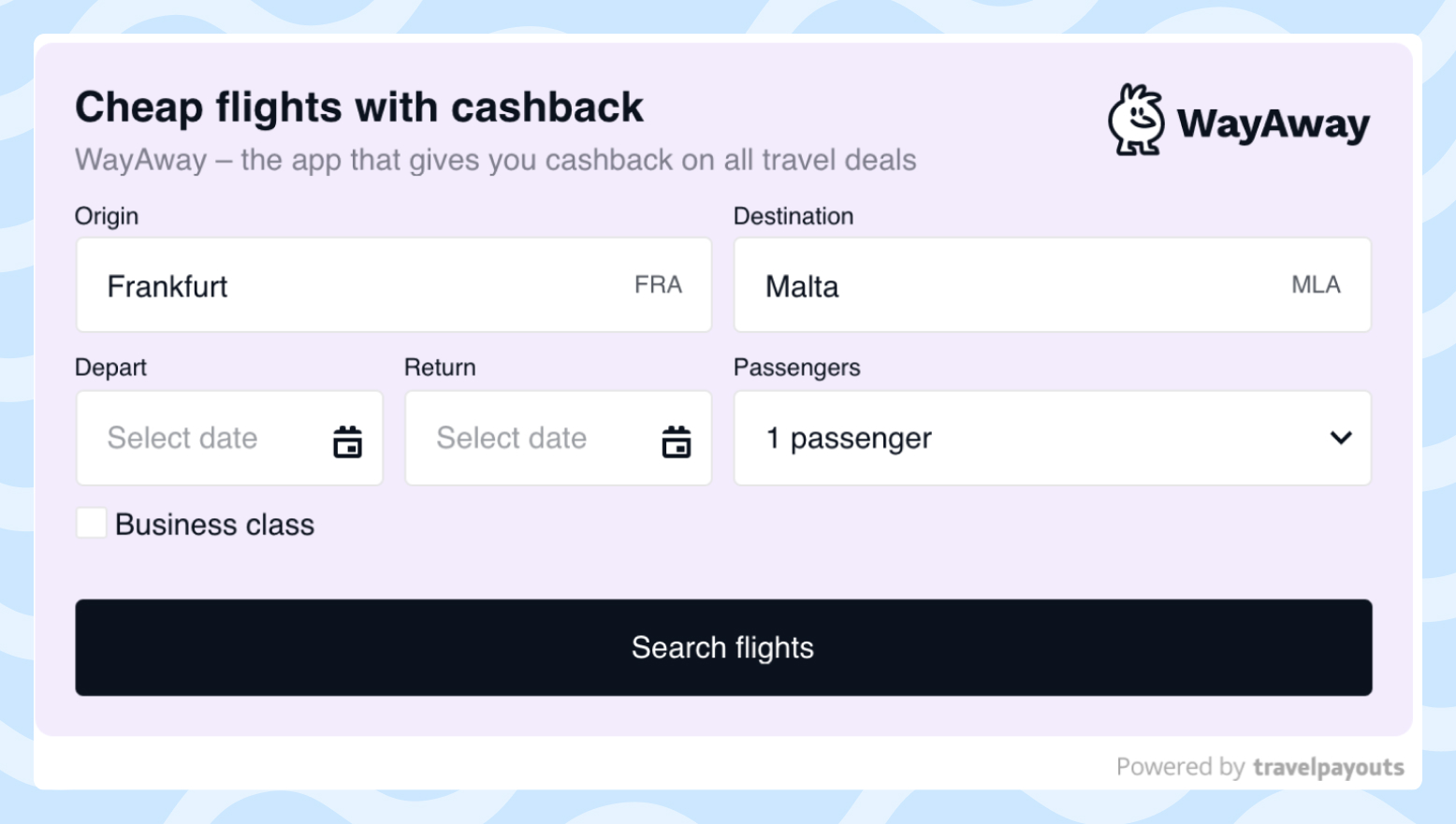
A widget is an interface element integrated into a webpage that allows users to get additional travel information and/or interact with various types of forms. For example, readers can use a widget to search for airline tickets by selecting their destination, passenger number, and travel dates.

According to Travelpayouts, the average profit per booking via widget is 2.5 times more than that for text affiliate links. That’s why we always recommend using widgets alongside links to maximize your income.

Next, the story will go from Clive in the first person.
Why Widgets Are a Must
There are many reasons why I prefer widgets to links.
- Widgets give users the opportunity to get extra content and interact with a page.
- While this seems to mostly concern product reviews, Google Search puts weight on content with affiliate widgets, because widgets add extra content to a webpage and let users choose the best travel option for them.
- My readers can find all the information they need in just one click and reserve hotels and activities easily from my website.
- In my experience, widgets perform better than links.
According to popular belief, widgets make pages look cluttered, kill page speed, and require coding skills to use. I’m here to tell you that this is not the case, and here’s why:
- I find that widgets fit well in both the main content and sidebars. Aesthetic elements such as colors and font can always be adjusted to the style of your site.
- I use Google Site Kit on all of my WordPress websites and haven’t noticed any speed issues when deploying widgets.
- The code will be created for you in the Travelpayouts dashboard, so all you need to know to add widgets is how to copy and paste.
How to Use Widgets to Monetize a Travel Blog
The widget is just one of the tools that I implement in my monetization strategy. Depending on my content, I use widgets either in addition to affiliate links or on their own.
Picking the Best Articles for Widgets
You have to remember that widgets themselves are just tools — if your article doesn’t provide helpful content for your audience, any monetization strategy you think of will fail. The widget is a tool that you can use to sell the travel service you are writing about.
Therefore, place widgets in articles where widgets can help your reader — these will likely include the articles you already place affiliate links in.
Here are some cases:
- If a person is looking for a cheap way to get to Los Angeles from their city, you can add a search form for flight tickets in the article
- If a person wants to organize 2-3 days in a new place and visit attractions, you can add a popular excursions widget
- If a person is planning a trip for Christmas and is looking for a cheap car rental, a car search form will come in handy.
The secret of widgets is that they empower the reader. For example, a person can immediately indicate on your website from where they want to fly to Los Angeles or where exactly they need a rental car. Such interactive elements may even increase conversion rates, since a person sees the results for their exact search request and not the brand’s main page or other page that you hardcoded into an affiliate link.
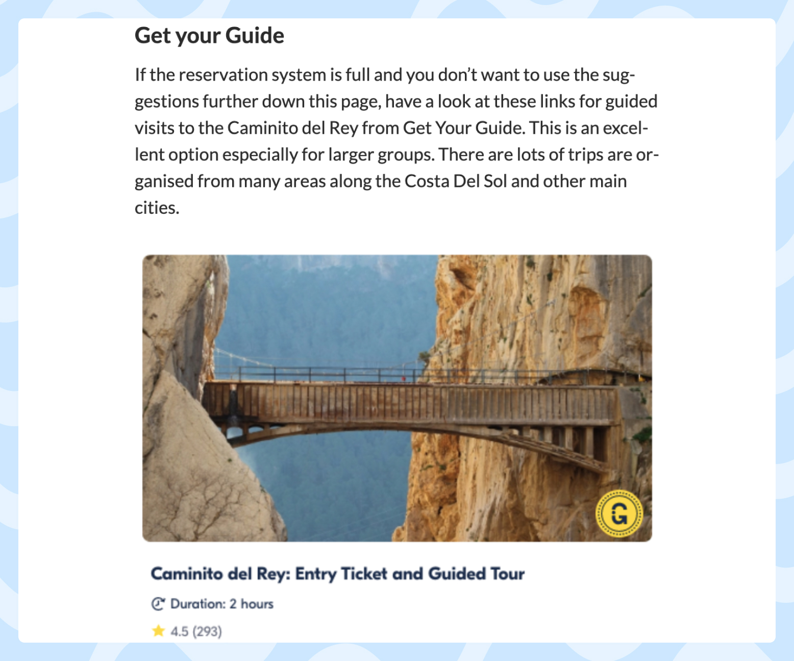
Take a look at the tour widgets in this article, where I talk about tickets. Readers who come to a webpage from a specific search query about tickets are likely to also be interested in tours:

So where would I recommend not using widgets? The same pages where affiliate links would not work, or where readers come to find answers to questions not related to a specific travel service and, therefore, have no need to purchase a travel service.
To sum up, place widgets on any page where they would be useful to your audience. But keep in mind that how to embed a widget is just as important as where you embed it.
How to Embed Widgets on a Website
I always insert widgets after a good title and an introduction of 2-3 paragraphs. There should always be a short paragraph before the widget that explains to your readers what it is and what they have to do to get/find/buy what they want.

You also have to give the reader an understanding of the value that they will get by clicking on the widget, so inserting widgets in the first paragraph is not the best idea. To convey value, you can:
- Explain the convenience of buying online
- Introduce the brand the reader will buy from
- Explain that tickets are more expensive offline or that they sell out quickly
I sometimes put widgets below the fold, while other times I stick them further down the page. On average, I include 3-6 widget offers in one article.
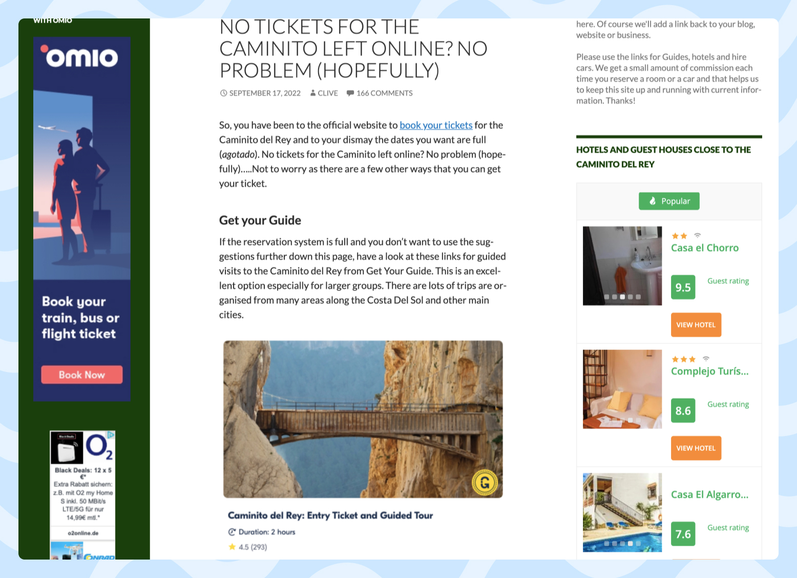
One of my best examples of widget placement can be found in my article about GetYourGuide for the Caminito Del Rey. It has a good title, introductory paragraphs, and the GetYourGuide widget set to 5 offers. Google Adsense is also deployed.
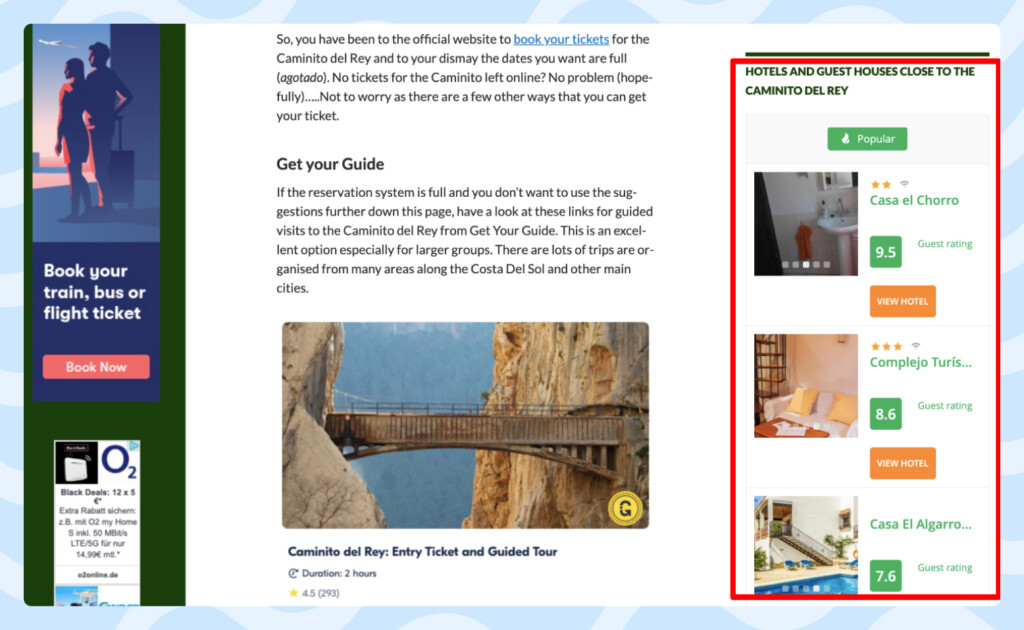
I also place widgets in the sidebar, and they repeat on all pages of the website. Here’s an example of one of my hotel widgets in a sidebar:

While something like hotels are a necessity for most tourists, you shouldn’t expect high conversions from sidebar placements. Conversion rates can be negatively impacted in part by banner blindness but also by the fact that traffic to your pages probably comes with a specific intent, such as buying tickets or a tour.
—
Want to share your story? Travelpayouts welcomes all bloggers with any travel-related experience. Write to us at ku@travelpayouts.com with the following subject: “Story for the Travelpayouts Blog”.


