Myth #1: Widgets Will Make My Page Look Cluttered
Many content creators believe that widgets will clog up their pages and overwhelm their readers. This myth is highly understandable. Nobody likes cluttered websites packed with too many elements.
However, this myth also has nothing to do with widgets. You can clutter a page with lots of other things, including links, ads, design elements, and more.
A user needs a clean, well-organized website to find what they are looking for, and widgets are one way to allow users to do just that. If harnessed properly, widgets become a logical addition to your content and create a seamless user experience.
💡 Insider Tip From Travelpayouts
To create a frictionless user experience, don’t overload your website with widgets. Instead, make sure the widgets you use are relevant to the page content. Fill them in depending on the context. This way, your page won’t look cluttered, but the widgets will provide a lot of value to your audience and drive conversions for you.

Myth #2: Widgets Will Kill My Page Speed and Ruin the User Experience
Here’s another common myth to leave behind: widgets slow down your page speed and disrupt the user experience.
While it is true that every widget, tool, or element (such as scripts, plugins, or libraries) that you install on your website will affect its score in Google’s PageSpeed Tool, widgets will not disrupt the user experience because Travelpayouts widgets are loaded asynchronously. This means that the widgets load separately from the rest of the page and don’t influence how quickly the user will see the rest of the page content.
Here’s another reason why you don’t need to worry a lot about the page loading speed. At Travelpayouts, we invest a lot of time and effort into improving the performance of widgets and optimizing their load speed. We also have a common code base for all widgets, which is distributed from your region’s CDN (content delivery network). As a result, the widget’s code is cached in the browser, and on subsequent visits, widgets are no longer loaded since the data is stored in the database.
However, this doesn’t mean that you should clutter your page with a lot of widgets. Keep the right balance and use widgets efficiently. After all, moderation is the key to success.
💡 Insider Tips From Travelpayouts
- To speed up your page, limit the number of widgets per page and don’t use too many third-party scripts, plugins, and libraries. These elements can significantly slow down your page speed or even destroy your page entirely.
- Don’t place widgets at the top of your post. First, you need to provide enough context to make widgets effective. Second, if you place a widget further in your post, it’ll finish loading before readers scroll down and will not disrupt the user experience.
Myth #3: Widgets Perform Worse Than Links
Some bloggers are convinced that links perform better than widgets when it comes to promoting a product or service, such as a tour or activity that the blogger wants to recommend.
However, if used properly, widgets are an incredibly effective promo tool because they are dynamic, engaging, and tend to receive a lot of clicks. In addition, they provide relevant information to customers and allow them to see offers that are directly relevant to the page content on your website, thus shortening the customer’s journey.
In addition, widgets work even better when combined with links. For example, in a post, you can promote the same tour using both a link and a widget. Travelpayouts research shows that, when widgets are used in combination with links, the average conversion to booking is 2.5 times higher.
💡 Insider Tip From Travelpayouts
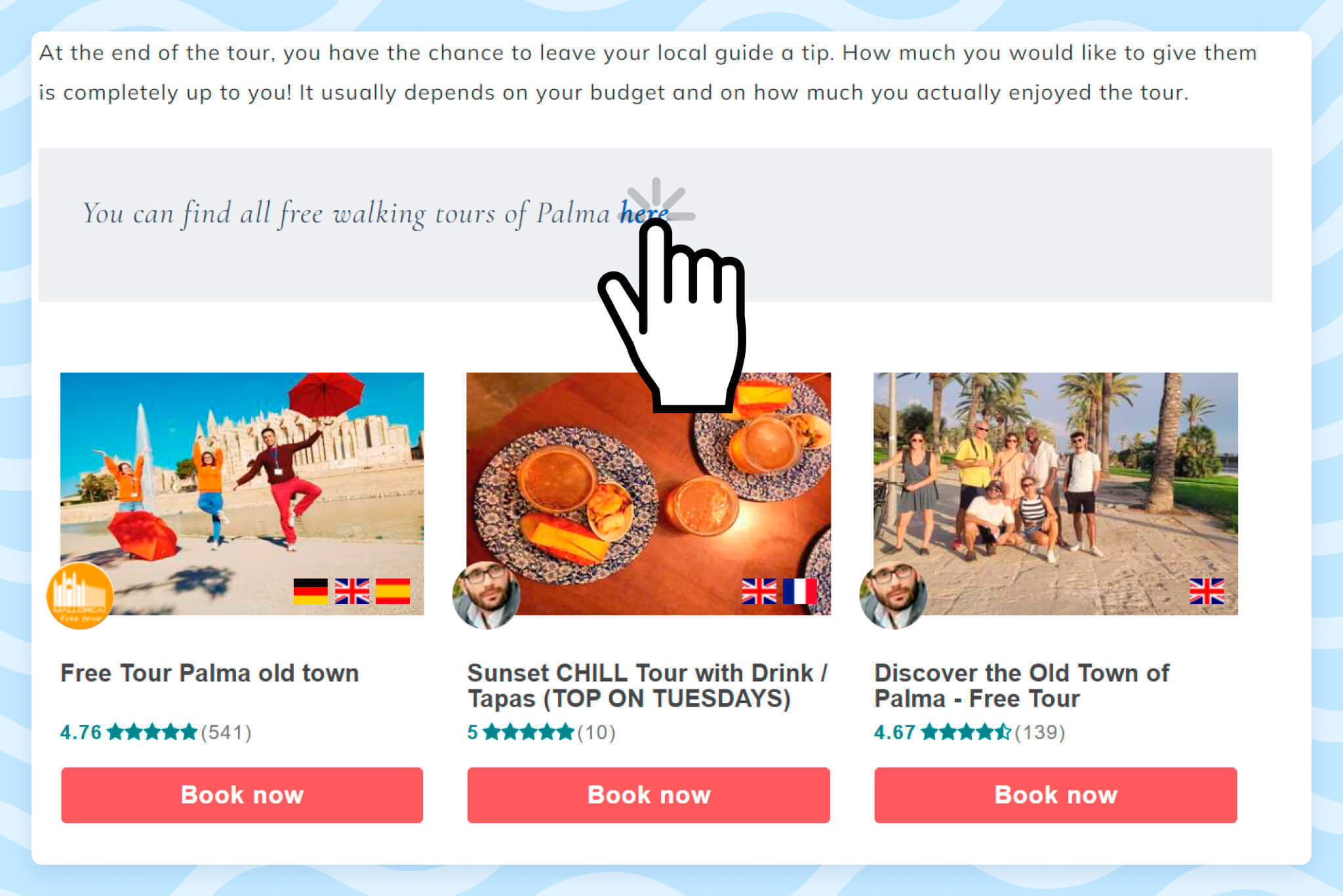
Use both affiliate links and widgets in your posts. These tools work well together and can help you drive tons of conversions. Here’s an example of a blog post that features both affiliate links and widgets.

Myth #4: Widgets Are Hard to Track
Here’s another common misconception: widgets are hard to track in contrast to affiliate links, which are easily trackable.
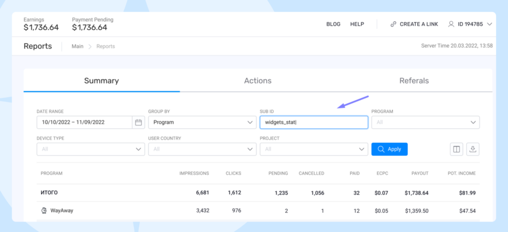
Let’s bust this myth once and for all. Widgets, as well as links, contain your partner ID, which allows you to track all the clicks and conversions on your Travelpayouts dashboard.
💡 Insider Tip From Travelpayouts
If you have both links and a widget in your post and want to track what performs better, use different sub IDs for links and widgets. To learn more about how to do this, check out this article.

Myth #5: People Just Scroll Past Widgets Thinking They’re Ads
Let’s debunk another sticky myth about widgets: they don’t convert because people just scroll past them thinking they are ads.
In reality, widgets often fail to drive conversions because of three common mistakes made by bloggers:
- randomly placing widgets in content
- providing no context
- giving no explanation for how users can benefit from using the widget
As a result, users don’t expect to see the widget in the post and don’t understand how they can benefit from it, which leads to banner blindness.
💡 Insider Tips From Travelpayouts
- Do not place your widget at the top of the page. Usually, users don’t expect to get important information at the very top of a post, which is why they are likely to scroll down quickly and look for the info they need.
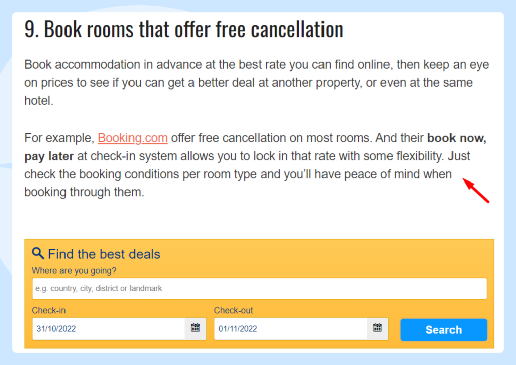
- Add widgets that neatly pair with your content. This will help provide relevance and keep users on the page. In this case, the user expects to see a widget and, therefore, pays attention to it. A widget without context can be perceived as a banner ad, which causes banner blindness. In such cases, the widget may not work.
- Provide additional context to why you’ve featured these products. This will not only help provide relevance to your audience, it could help your page rank better with search engines. So, make sure to create a logical lead that explains why there is a widget in your content and how users can benefit from clicking it. Here’s an example of a good lead for a widget:

Myth #6: Using Widgets Requires Coding Skills and a Lot of Time
Let’s address another myth about widgets that we hear time and time again: using widgets is hard and requires some coding skills.
Let’s set the record straight. At Travelpayouts, widgets are super easy to install and require zero coding skills. In addition, they can be added to your website in just a few clicks. To learn how to do it, watch the following video.
Conclusion
Hopefully, we’ve managed to clear up the most common myths about widgets for you. But there are many more. If you’ve heard any other opinions about widgets that you believe may be a myth, let us know in the comments below. Now, follow the tips we’ve shared in this post, add travel widgets to your content and boost your revenue.


